Your font can make a difference

Photo by Markus Spiske on Unsplash
Arial or Times New Roman? It is not a mere aesthetic choice.
In the last years people have come up with many different solutions to try to use less ink to print huge amounts of documents. One of these is as ordinary as brilliant: changing font and choosing a lighter one.
The University of Wisconsin-Green Bay acknowledges a decrease by 30% in their yearly usage of toner following a simple change of font from Arial to Century Gothic in the official documents and emails. Even though the university administration encourages staff and students to print as little as possible (above all emails), the university has chosen to change font as part of a five-year program to minimize pollution and waste within the campus. According to a university’s spokesperson, ink corresponds to 60% of the cost of a single printed page, with a total cost of $10000 per gallon.
In an interview to National Public Radio, professor Matthew Dornbush – promoter of the initiative – said he is aware that it “won’t save the planet”, even though he is convinced of the good nature of this conversion. But it can teach students to actively look for change even in the smallest things.
"We're training the students who then go out into the workplace, and if they become used to things like that, this here or slightly colder offices or whatever, they're more likely to then implement these into the businesses and so forth when they leave here."
The University of Wisconsin’s choice lies on solid foundations: reducing the impact of print means reducing the consumption of its two main components, paper and ink. The choice of font plays a significant role. Weight, dimensions, kerning, be it serif or sans-serif: a lighter or sans-serif font uses less resources and contributes to faster printing, at the same time increasing the potential of paper recycling and reducing the amount of used sheets. However, it isn’t always possible to choose this freely: one must often compromise between the readability of documents and the design guidelines of one’s own brand, often very strict when it comes to fonts.
Some designers thus decided to develop fonts with the imprint of sustainability from the very start. For instance Ecofont, a font developed in the Netherlands and designed to reduce printing ink at the same time maintaining the same readability as a font of equal dimensions. Ecofont is indeed punctuated by small flowers that make letters almost indistinguishable from other fonts of the same dimensions, in which most documents are printed. The technology behind Ecofont can be also applied to other fonts, and it saves 15% compared to the main fonts. 2014 saw the launching of the font Ryman Eco, whose design is made of thin lines that create an empty space inside each letter, thus reducing ink usage.
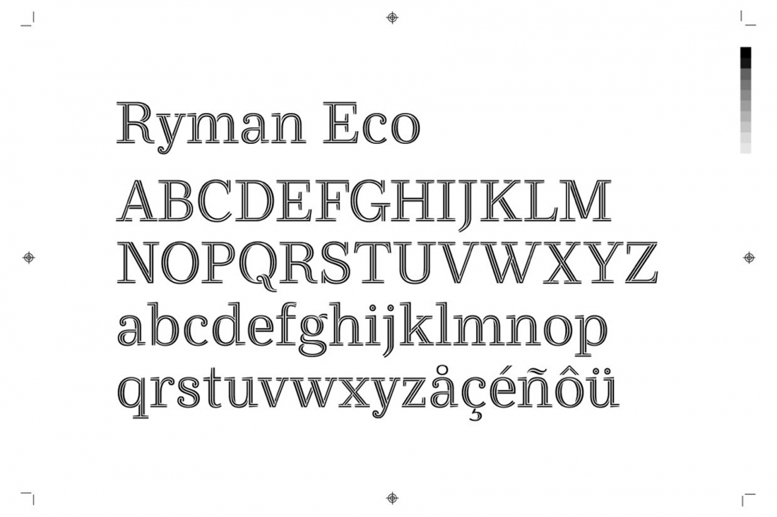
Photo by Ryman